Real-Time Research Visualization Platform
Fiber Sensing Visualization Platform
A real-time web visualization platform that replaced a legacy LabVIEW interface for NEC's distributed fiber-optic sensing research, turning high-volume streaming measurements into interactive room-scale views for researchers and executive leadership.
Overview
NEC's LS3300 distributed fiber-optic sensing system can detect disturbances along a fiber cable, producing high-volume signal streams that are powerful but difficult to interpret directly. The goal of this project was to make those signals understandable during research demonstrations by translating raw sensing data into visual views of movement, vibration, frequency behavior, and spatial localization.
I extended NEC's existing Python processing pipelines and RabbitMQ messaging infrastructure to replace a legacy LabVIEW interface with a browser-based platform. The system processed 10–20 million distributed fiber sensing data points per second and transformed them into interactive visualizations that made complex system behavior understandable to non-technical audiences and executive leadership. I also developed a real-time spatial localization pipeline that processed streaming measurements from 230 meters of distributed fiber, inferred activity locations through statistical estimation, and projected them onto physical floor layouts to enable live room-scale motion tracking.
Demo Storytelling
Part of the challenge was explaining distributed fiber sensing to audiences who had never encountered the technology before. Beyond building technical visualizations, I also created animations that helped connect the sensing hardware to its real-world applications, making it easier for researchers, visitors, and leadership to understand both how the system worked and why it was useful.
Explaining the Sensing Process
Animation connecting the LS3300 sensing unit, fiber cable, and signal changes generated by movement
Illustrating Real-World Applications
Concept animation illustrating how distributed fiber sensing could provide situational awareness across a large space, helping non-technical audiences visualize potential applications without relying on cameras at every location
Problem
The browser-based platform needed to solve several challenges:
- Raw fiber signals were high-volume and difficult to interpret directly
- Fiber measurements existed in one-dimensional index space rather than physical room coordinates
- The demo needed to connect raw sensing activity to real-world movement in the room
- Noise and baseline drift made simple thresholding and color scaling unreliable
- Live demonstrations required coordinating UDP data streams, backend processing, RabbitMQ/STOMP messaging, and browser visualizations
- Experimental floor-localization logic needed to be separated into reusable frontend and backend workflows
Solution
I built and refactored a browser-based visualization platform on top of the existing sensing and streaming infrastructure. The system supported live, simulated, and replayed sensing data, then rendered those streams through interactive browser-based views.
RabbitMQ Messaging Architecture
The visualization platform used RabbitMQ as the messaging layer between Python processing pipelines and browser-based clients. Depending on the demo, messages were either relayed through a Python backend or sent directly between browsers and RabbitMQ using STOMP. Routing keys allowed different visualizations to subscribe only to the message streams they needed.
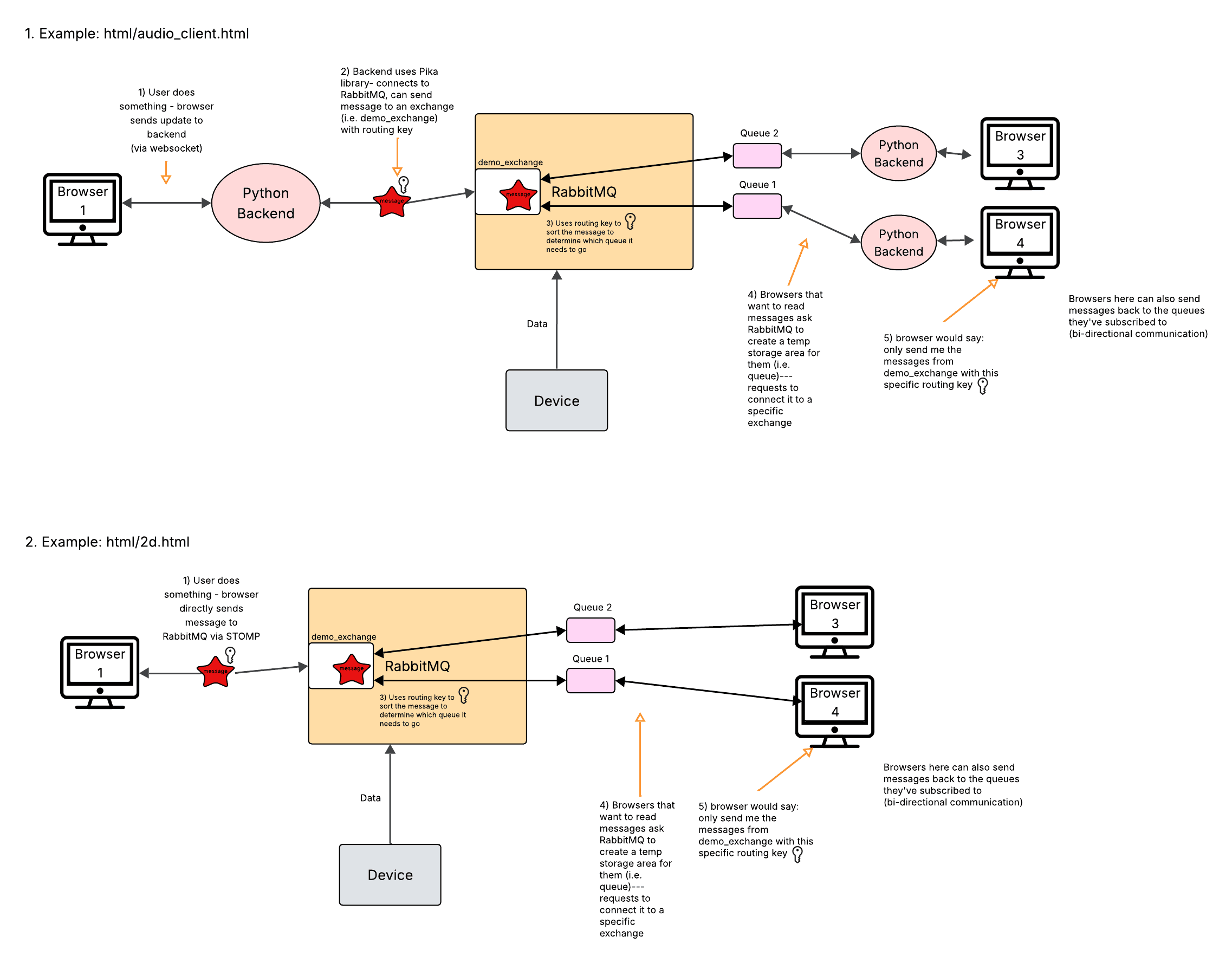
Diagram showing two RabbitMQ communication patterns used by the demo: Python-backend-mediated messaging and direct browser-to-RabbitMQ STOMP messaging
Real-Time Visualization Frontend
Built browser-based Three.js views for floor maps, raw signal displays, waterfall plots, frequency-location plots, PCA views, activity histograms, and spatial heatmaps. These views helped translate abstract sensor streams into visuals that could be used during research demonstrations.
Spatial Localization
Mapped one-dimensional fiber measurements to two-dimensional room coordinates using segment geometry and fiber-index lookup logic, allowing the demo to show sensing activity on a physical floor layout instead of only as signal traces.
Signal Calibration and Activity Detection
Experimented with baseline calibration, z-score coloring, rolling and EWMA baselines, median/MAD calibration, persistent histograms, and decay-based activity maps to make movement easier to distinguish from noise.
Backend Processing Refactor
Refactored backend FloorWriter logic to separate legacy streaming histogram behavior from newer batch activation-based localization logic, making the system easier to test, compare, and extend.
Demo Infrastructure
Added simulated and playback data paths and automated the multi-process demo startup with tmux, coordinating backend processing, UDP ingestion, and frontend serving for faster testing.
From Fiber Cable to Physical Movement
One of the biggest lessons from this project was realizing that localization was much harder than it initially appeared.
The sensing system measured activity along a one-dimensional fiber cable, but users wanted to know where someone was standing inside a room. Because the fiber doubled back on itself beneath the floor, a single physical location could influence multiple fiber regions, making the relationship between signal and position ambiguous.
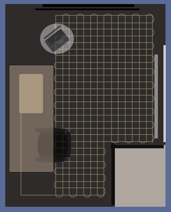
Left: simplified fiber routing beneath the demo room. Right: early movement-tracking visualization projecting sensing activity onto the room layout
To make the data more interpretable, I built a mapping layer that translated fiber indices into physical room coordinates and projected sensor activity onto a floor layout. While the resulting visualizations were effective for demonstrations, they also revealed the limitations of the approach and motivated later experiments with histogram-based localization, activity persistence, interpolation, and PCA-based analysis.
The hardest part of localization was not rendering the visualization. It was understanding the assumptions hidden behind it.
Spatial Heatmap Experiments
After mapping fiber indices to x/y coordinates, I experimented with interpolation and activity accumulation methods to make movement patterns easier to interpret as spatial heatmaps.
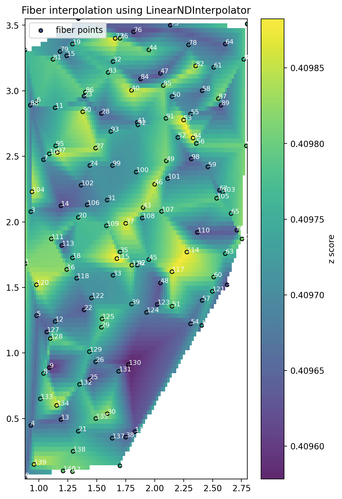
Interpolation experiment using mapped sensing locations and z-score-calibrated activity values
Signal Calibration and Baseline Tracking
Because the sensing data contained noise and baseline variation, I tested calibration views that showed expected activity, histogram behavior, and deviations from baseline. These views helped separate meaningful movement from random fluctuations.
Calibration view showing baseline activity, spatial noise, and histogram behavior during quiet periods
Frequency and Dimensionality Experiments
I also explored ways to make frequency behavior easier to inspect across many fiber locations. One experiment used PCA to project location-level frequency data into a smaller set of principal components, making it easier to reason about correlated vibration patterns.
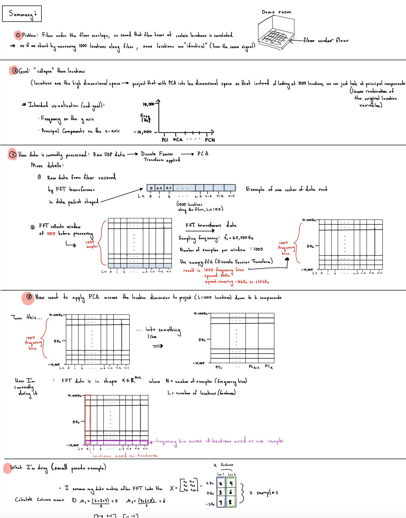
Exploratory notes on reducing fiber-location dimensions after FFT so frequency behavior could be viewed across fewer principal components
Demo Hardware Visualization
I also created supporting visual assets, including a Blender model of the LS3300 sensing unit, to make the physical hardware easier to explain alongside the live signal visualizations.
Blender model used as a demo storytelling asset for explaining the LS3300 sensing unit
Acoustic Fingerprint Demo
One of the more fun demo assets I worked with synced music playback to the system's acoustic response, showing how different sounds produced distinct sensing patterns along the fiber. It helped make the idea of an “acoustic fingerprint” more intuitive for non-technical viewers.
Music-synced demo showing how sound produced a recognizable acoustic fingerprint in the fiber sensing data
Results
- Extended NEC's existing Python processing pipelines and RabbitMQ messaging infrastructure to replace a legacy LabVIEW interface with a real-time web visualization platform
- Processed 10–20 million distributed fiber sensing data points per second and transformed them into interactive visualizations that made complex system behavior understandable to non-technical audiences and executive leadership
- Developed a real-time spatial localization pipeline that processed streaming measurements from 230 meters of distributed fiber, inferred activity locations through statistical estimation, and projected them onto physical floor layouts to enable live room-scale motion tracking
- Built a browser-based visualization platform for live, simulated, and replayed LS3300 fiber sensing data
- Created 15+ interactive visualization modes across signal, frequency, spatial, and demo storytelling views
- Transformed 20 kHz multi-channel sensing streams into real-time floor maps, FFT/PCA views, activity histograms, and spatial heatmaps
- Mapped one-dimensional fiber measurements to two-dimensional floor coordinates for spatial activity visualization
- Built floor-layout views that connected raw signal changes to visible movement in the room
- Implemented baseline calibration, z-score coloring, persistent histograms, and heatmap-style localization experiments
- Refactored backend FloorWriter logic to separate legacy streaming behavior from newer localization workflows
- Added simulated and playback data support for development and demonstrations without live hardware
- Automated multi-process demo startup with tmux for faster testing
What I Learned
This project was my first experience working on a research system where the correct answer was not always known ahead of time. Many of the challenges were not traditional software bugs. They came from noisy data, changing requirements, imperfect assumptions, and the difficulty of connecting physical behavior to sensor measurements.
I learned how to work across the stack, from backend processing and messaging infrastructure to frontend visualization and demo design. More importantly, I learned that a convincing visualization is only useful if you understand the assumptions that produced it.
That lesson has influenced how I approach data-driven systems ever since: before asking what the data says, first ask what assumptions need to be true for that conclusion to make sense.
Technologies
Python, JavaScript, Three.js, RabbitMQ, STOMP, UDP, HTML, CSS, Signal Processing, FFT, PCA, Data Visualization, Blender, tmux